
Every tooltip, dropdown, and popover you've ever built had the same annoying requirement: keep this floating box glued to that button, even when the user scrolls, resizes, or the box is about to fall off the screen. For years the answer was JavaScript. You pulled in Floating UI or Popper.js, measured bounding rectangles, listened for scroll and resize events, and recalculated positions on every frame.
CSS anchor positioning kills that whole category of code. You tether the floating element to its trigger in pure CSS, the browser handles edge collisions for you, and none of it runs on the JavaScript main thread. It works in Chrome and Edge 125+, Safari 26+, and Firefox 147+, so as of early 2026 all three major engines ship it. This guide builds a tooltip from scratch, places it with a clean grid syntax, makes it flip at the viewport edge, wires it into the native Popover API, and falls back gracefully on older browsers.
What is CSS anchor positioning, and why does it matter?
CSS anchor positioning lets you tie one element's position to another element, called the anchor, entirely in CSS. It replaces the JavaScript you used to write to keep a tooltip or dropdown glued to its trigger.
The old approach worked, but it was a lot of moving parts. A library like Floating UI calls getBoundingClientRect on the anchor, computes where the floating element should go, and re-runs that math on every scroll and resize event. That's JavaScript executing on the main thread, dozens of times a second while you scroll, just to keep a box in the right spot. It's also a dependency to install, update, and ship to every visitor.
Anchor positioning moves all of that into the browser's layout engine. You declare the relationship once in CSS, and the browser keeps the elements tethered natively, including when the page scrolls. No listeners, no recalculation in your code, no bundle cost.
How do you anchor one element to another?
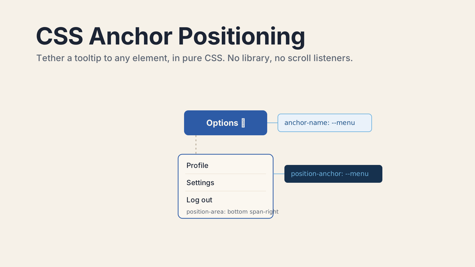
You give the anchor a name with anchor-name, reference that name from the positioned element with position-anchor, then place the element's edges using the anchor() function.
Three properties, that's the whole core. Here's a tooltip pinned under a button:
/* 1. name the anchor */
.menu-button {
  anchor-name: --menu-button;
}

/* 2. point at it, and 3. place yourself relative to it */
.menu {
  position: absolute;
  position-anchor: --menu-button;
  top: anchor(bottom); /* my top edge sits on the anchor's bottom edge */
  left: anchor(left); /* my left edge lines up with the anchor's left edge */
  margin-top: 8px;
}The anchor() function is the key. Inside an inset property like top or left, anchor(bottom) resolves to the position of the anchor's bottom edge. So top: anchor(bottom) reads as "put my top where the anchor's bottom is." The anchor name starts with two dashes, the same syntax as a custom property, and it's scoped so you can reuse names across independent components.
One thing trips people up early: the positioned element has to be position: absolute or fixed for anchor() and position-area to do anything at all. Without it, the browser ignores both properties and your element just sits wherever normal flow put it. If your tooltip isn't moving, that's the first thing to check.
How do you place an element with position-area?
position-area drops the element into a 3x3 grid centered on the anchor, using plain keywords like top center or bottom span-right. It's simpler than wiring up anchor() for every edge.
Picture a 3-by-3 grid laid over the anchor. The center cell is the anchor itself, and the eight surrounding cells are where you can place your element. You name a cell with a row keyword (top, center, bottom) and a column keyword (left, center, right):
.tooltip {
  position: absolute;
  position-anchor: --target;
  position-area: top center; /* sit directly above the anchor, centered */
  margin-bottom: 8px;
}That single position-area line replaces two or three anchor() calls. The span-* keywords let an element stretch across cells, so position-area: bottom span-right places it below the anchor and extends it rightward, which is exactly what you want for a dropdown menu that aligns to the left edge of its button and grows down and to the right.
There's a matching function for size, too. anchor-size() reads the anchor's dimensions, so width: anchor-size(width) makes a dropdown exactly as wide as the button that opened it. That's another measurement you used to do in JavaScript and can now hand to the browser.
How do you make a popover flip at the viewport edge?
You list fallback positions with position-try-fallbacks. The browser uses your preferred position until the element would overflow the viewport, then automatically switches to a fallback.
This is the feature that used to justify the whole JavaScript library. A tooltip above a button is fine, until that button is near the top of the screen and the tooltip gets clipped. With anchor positioning, you describe the fallback and the browser does the flipping:
.tooltip {
  position: absolute;
  position-anchor: --target;
  position-area: top center;
  position-try-fallbacks: flip-block; /* overflow the top? flip to below */
}flip-block mirrors the position across the block axis, so top center becomes bottom center when there isn't room above. For finer control, define a named try option with the @position-try at-rule and list several fallbacks in order:
@position-try --below {
  position-area: bottom center;
  margin-top: 8px;
}

.tooltip {
  position-area: top center;
  margin-bottom: 8px;
  position-try-fallbacks: --below, flip-inline; /* tried in order until one fits */
}The browser walks your fallback list top to bottom and uses the first option where the element fits on screen. You get smart, collision-aware positioning without measuring a single rectangle yourself.
How do you wire this into the HTML Popover API?
Anchor positioning pairs directly with the native popover attribute. You set anchor-name on the trigger and position-anchor on the popover, and the browser tethers the popover to the button even though the popover lives in the top layer.
<button popovertarget="menu" style="anchor-name: --menu-btn">Options</button>

<div id="menu" popover style="position-anchor: --menu-btn; position-area: bottom span-right">
  <a href="/profile">Profile</a>
  <a href="/settings">Settings</a>
  <a href="/logout">Log out</a>
</div>The Popover API gives you the open/close behavior, light-dismiss, and top-layer rendering for free. Anchor positioning gives you the placement. Together they're a complete dropdown menu with no positioning JavaScript at all. If you want to style the open and closed states too, the CSS :open pseudo-class handles that side of the same component, so the entire menu (state and placement) lives in CSS.
Because the popover renders in the top layer, it escapes overflow: hidden and stacking-context traps that used to break dropdowns inside scrolling containers. The anchor reference still resolves correctly across that boundary.
How do you add a fallback for older browsers?
You wrap the anchor rules in @supports (anchor-name: --x) and ship a classic absolute-positioning fallback outside it. Older browsers get a usable position, modern ones get true anchoring.
Progressive enhancement is the safe way to adopt this today. Write the boring fallback first, then layer the anchor positioning on top only where it's supported:
/* fallback: plain absolute positioning, works everywhere */
.tooltip {
  position: absolute;
  bottom: 100%;
  left: 50%;
  transform: translateX(-50%);
}

@supports (anchor-name: --x) {
  .anchor {
    anchor-name: --target;
  }
  .tooltip {
    position-anchor: --target;
    position-area: top center;
    bottom: auto;
    left: auto;
    transform: none;
  }
}The feature query checks whether the browser understands anchor-name. If it does, the anchored rules win and override the fallback. If it doesn't, the browser skips the whole block and the element stays where the basic CSS put it. One more useful tool here is position-visibility: anchors-visible, which automatically hides the anchored element when its anchor scrolls out of view, so a tooltip doesn't float over unrelated content after the trigger leaves the screen.
Should you delete Floating UI today?
For tooltips, dropdowns, and popovers in modern browsers, you genuinely can. Pair anchor positioning with an @supports fallback and you lose nothing on older browsers while shipping less code everywhere else.
The win that's easy to undersell is where the work happens. JavaScript positioning libraries run on the main thread, competing with your app's actual logic and recalculating on every scroll tick. Anchor positioning runs in the browser's layout engine, so scrolling stays smooth and your bundle gets smaller. You'd keep a library only to support browsers without a fallback path, or for positioning logic that CSS can't yet express. Stack anchor positioning with the Popover API and the :open pseudo-class, and the interactive components we've been shipping JavaScript for since 2015 are now mostly just CSS. That's the part worth getting excited about.
For the full reference, see the MDN CSS anchor positioning guide and Chrome's introduction to the anchor positioning API, which covers the design and edge cases in depth.
Keep Reading
- How to Style Open Dropdowns with the CSS :open Pseudo-Class. Position the dropdown with anchor positioning, style its open state with :open. The two modern-CSS halves of a native dropdown.
- How to Style Scrollbars Without a Plugin in Tailwind v4.3. More modern CSS that drops a dependency, this time for scrollbars.
- How to Measure Core Web Vitals in a Single-Page App. Moving positioning off the main thread is one less thing hurting your interaction metrics.