
I have wanted this one for years. Every time I styled a custom dropdown and the design called for a different look while it was open, I reached for JavaScript. Add a class on click, remove it on blur, fight the focus edge cases, repeat. For a native <select>, it was worse: you basically couldn't style the open state at all without replacing the whole control.
Then CSS quietly shipped :open, and the whole dance goes away. It's a pseudo-class that matches an element only while it's in its open state. No attribute juggling, no event listeners. And almost nobody noticed it land.
Here's exactly what it matches, how to style a native select with it, and where it works today.
What is the CSS :open pseudo-class?
The CSS :open pseudo-class matches any element that has open and closed states, but only while it's currently open. That's the whole idea, straight from the spec wording: it "represents an element that has open and closed states, only when it is currently in the open state."
So a <details> you've expanded matches :open. A <dialog> you've shown matches :open. And, the part that changes real work, a <select> matches :open while its drop-down is on screen. The moment it closes, the element stops matching and your :open styles fall away on their own.
You write it like any other pseudo-class:
:is(select, input):open {
  border-color: #2d5ba6;
}

details:open > summary {
  background-color: #eef4fa;
}No script. The browser tracks the open state and applies your rules for exactly as long as the element is open.
Which elements does :open actually match?
:open matches four kinds of elements in their open state, and the list is worth memorizing because it's broader than people expect. Per MDN, these are the elements with genuine open and closed states:
<details>and<dialog>while they have theopenattribute set. You could already target these withdetails[open], so:openis a convenience here, not a new power.<input>elements that show a picker, like<input type="color">or<input type="date">, while that picker is on screen.<select>elements while their drop-down picker is showing.
That third and fourth bullet are the reason this pseudo-class exists. A select and a date input don't have an open attribute. There was no selector that meant "this native control is currently showing its picker." Now there is.
One detail that trips people up: open and closed are semantic states, not visibility states. A <details> that's expanded matches details:open even if you've hidden it with visibility: hidden. The element is still semantically open. So :open is about the control's state, not whether you can see it.
And one thing it does not match: popovers. An element with the popover attribute has its own showing and hidden states that live alongside open and closed. To style a popover while it's showing, reach for :popover-open instead of :open. Mixing those two up is the most common mistake I see with this feature.
How do you style a native select while it's open?
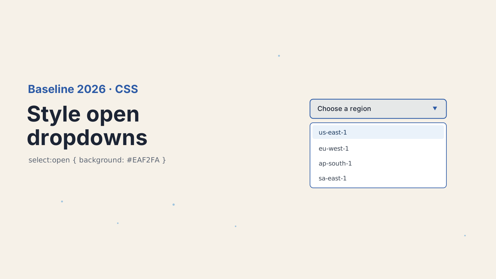
Use select:open to target the control while its drop-down is showing, then label:has(select:open) to style whatever wraps it. This is the pattern I now use everywhere a form has a styled select.
/* tint the select itself while the drop-down is open */
select:open {
  background-color: #eaf2fa;
  border-color: #2d5ba6;
}

/* and highlight the label wrapping it */
label:has(select:open) {
  outline: 2px solid #2d5ba6;
}That's it. When the user opens the drop-down, the control gets a sapphire tint and its label lights up. When they pick a value or click away, both revert. No onfocus, no onblur, no state variable, no re-render.
The :has() half is what makes this feel complete. Before, even if you could detect the open state, you couldn't easily reach back up to the parent to style it. label:has(select:open) reads as "a label that contains an open select," and it styles the label. Two of the newest selector features, working together, replace a chunk of the JavaScript that used to glue native form controls to their surroundings.
How is :open different from the [open] attribute selector?
The [open] attribute selector only matches <details> and <dialog>, while :open matches those plus <select> and <input> pickers. That gap is the entire point, so it's worth seeing side by side.
details[open] works because <details> literally has an open attribute in the DOM. So does <dialog>. But a <select> showing its drop-down has no attribute that flips, and neither does a date input showing its calendar. The browser knows they're open, but until :open there was no way for a selector to ask. That's why people fell back to JavaScript: not because the logic was hard, but because CSS had no hook into that state.
If you need the closed state, there's no :closed pseudo-class. Use negation instead: select:not(:open) for a closed select, or details:not([open]) if you prefer the attribute form. This is the same pure-CSS-over-JavaScript trend I wrote about with styling scrollbars without a plugin in Tailwind. The platform keeps absorbing jobs we used to hand to scripts.
How do you style the surrounding UI with :has(select:open)?
Combine :open with :has() to style any ancestor or sibling based on whether a control is open. The select example above used a label, but the wrapper can be anything.
/* raise the whole field card while its select is open */
.field:has(select:open) {
  box-shadow: 0 8px 24px rgba(45, 91, 166, 0.18);
}

/* dim everything else on the form while one menu is open */
form:has(select:open) .field:not(:has(select:open)) {
  opacity: 0.6;
}That second rule is the kind of thing that used to need a state manager. "When any select on this form is open, fade the other fields." Now it's one selector. I'd go easy on effects like that in production, since a heavy box-shadow or opacity shift on every open can feel busy, but the capability is there and it costs nothing at runtime.
The thing to watch is specificity and reach. :has() looks at descendants, so form:has(select:open) recomputes as selects open and close. Browsers are good at this now, but don't wrap your entire layout in a :has(:open) rule that forces a big repaint on every interaction. Scope it to the closest sensible container.
Which browsers support the CSS :open pseudo-class?
:open reached Baseline Newly available in May 2026, which means it works across the current versions of all the major browsers. The major engines shipped support through late 2025 and spring 2026, and once the last one landed it crossed into Baseline.
For anything older, feature-detect and provide a fallback. The cleanest way is an @supports query that tests the selector itself:
@supports not selector(:open) {
  /* older browsers: keep a sensible default, or fall back to JS */
  select:focus {
    border-color: #2d5ba6;
  }
}selector(:open) inside @supports asks the browser whether it understands the selector at all, so you can ship a graceful default. In practice, since the feature is an enhancement to an already-working control, the no-support path is usually just "the select looks normal while open," which is fine. Nobody's form breaks because the open-state tint didn't apply.
Should you use the CSS :open pseudo-class in production today?
Yes, as a progressive enhancement, with no hesitation. The downside case is that an older browser shows the plain open state, which is exactly what every browser did a year ago. There's no broken layout, no error, no fallback bug to chase. You're adding polish that newer browsers honor and older ones quietly ignore.
What I keep thinking about is how much custom-component sprawl this quietly undercuts. A huge share of "styled select" libraries exist for one reason: you couldn't style the native open state. That reason is now gone for a lot of cases. Before you reach for a 40 KB dropdown component on your next form, try a native <select> with select:open and :has(). You might find the platform already does what you were about to install.
For the full spec details and the exact support data, see the MDN reference for :open and the web.dev Baseline digest for May 2026.
Keep Reading
- How to Style Scrollbars Without a Plugin in Tailwind v4.3. Another native-CSS styling win that replaces a dependency.
- How to Measure Core Web Vitals in a Single-Page App. Keep the interactions you're styling fast, not just pretty.
- How to Use the React Activity Component for Instant Navigation. More platform-level features that cut JavaScript out of common UI patterns.