
Every form validation tutorial I read for years started the same way: add an onChange handler, track a touched flag, store errors in state, then re-render. That is a lot of moving parts to draw a red border. The browser already knows the field is invalid. CSS just could not ask the parent about it.
That changed. With the :has() pseudo-class, a wrapper can style itself based on the input inside it, and a form can style its submit button based on every field at once. Pair that with :user-invalid and you get form feedback that only shows up when the user actually earns it. No JavaScript, no library, no flash of red on an empty page. Here is the full pattern, the snags that bite, and how to ship it without breaking older browsers.
What is the CSS :has() pseudo-class?
The CSS :has() pseudo-class matches an element if any of the relative selectors passed as an argument match at least one element anchored against it. In plain terms, it is the parent selector CSS never had. :has() lets an element react to its own descendants or following siblings, which is exactly what CSS :has() form validation styling needs.
A quick mental model. .field input:invalid styles the input. .field:has(input:invalid) styles the .field wrapper because of the input. The anchor flips from the matched element to its ancestor.
/* Styles the input itself */
.field input:invalid {
  border-color: #c0392b;
}

/* Styles the wrapper, driven by the input's state */
.field:has(input:invalid) {
  background: #fdecea;
}One thing worth knowing up front: :has() takes on the specificity of the most specific selector in its arguments, the same way :is() and :not() do. So .field:has(input:invalid) weighs the same as .field input:invalid. That matters when your rules start fighting each other.
:has() has been Baseline widely available since December 2023, so every current version of Chrome, Safari, Firefox, and Edge supports it. This is not a "behind a flag" feature anymore.
How do you style a field group when an input is invalid?
Wrap each input in a container and point :has() at the input's validity state. The cleanest structure is a .field div holding the input, its label, and an error message.
<form>
  <div class="field">
    <input id="email" type="email" required placeholder=" " />
    <label for="email">Email</label>
    <p class="error">Enter a valid email address.</p>
  </div>
  <button type="submit">Sign up</button>
</form>Now the CSS. Hide the error by default, then reveal it only when the field holds an invalid input.
.field .error {
  display: none;
  color: #c0392b;
  font-size: 0.85rem;
}

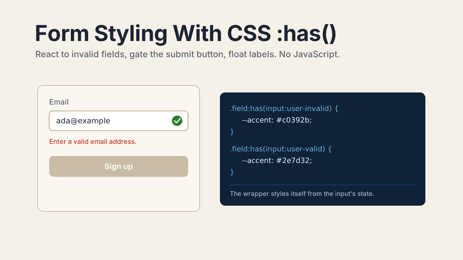
.field:has(input:user-invalid) {
  /* turn the whole group red */
  --field-accent: #c0392b;
}

.field:has(input:user-invalid) .error {
  display: block;
}

.field:has(input:user-valid) {
  --field-accent: #2e7d32;
}Notice I reached for :user-invalid, not :invalid. That is the difference between a form that feels helpful and one that yells at people. More on that next.
The trick I lean on here is a CSS custom property. The :has() rule sets --field-accent, and the input border, label, and any icon all read from that one variable. One source of truth per field, set by the field's own state.
Why does :invalid fire too early, and how does :user-invalid fix it?
:invalid matches the instant a value fails its constraints, including on page load when every required field is still empty. So if you style with :invalid, the user lands on your signup form and immediately sees red borders on fields they have not touched. That reads as broken.
:user-invalid solves it. It matches an invalid, out-of-range, or blank-but-required element only between the time the user has tried to submit the form and before they interact with that element again. In other words, it waits until the user has actually attempted something. It has been Baseline widely available since November 2023, right alongside :has().
So the rule of thumb I follow:
- Per-field error feedback (red border, error text): use
:user-invalid. Show it after the user engages, never before. - State you want enforced from the very first render (like a disabled submit): use
:invalid. You want that locked from the start.
There is a matching :user-valid for the happy path, which is how the green "looks good" state above works. Together they give you the full "untouched, then judged" lifecycle without a single touched boolean in JavaScript.
How do you disable the submit button when required fields are empty?
Point :has() at the form and ask whether it contains any invalid field. Because the submit button is a sibling of the fields inside the same form, the form can style it based on the whole set.
form:has(:invalid) button[type='submit'] {
  opacity: 0.5;
  cursor: not-allowed;
}

form:has(:invalid) button[type='submit']:hover {
  /* kill the hover affordance while blocked */
  opacity: 0.5;
}Here I deliberately used :invalid, not :user-invalid. I want the submit button to look unavailable the moment the page loads, while the form is still incomplete, and to light up only once every field passes. That is the one place where reacting "too early" is the correct behavior.
A caution. This dims the button, it does not truly disable it. For real submission blocking you still want the required attribute (which gives you native browser blocking on submit) or a disabled state. Treat the :has() styling as the visual layer on top of HTML's built-in constraint validation, not a replacement for it. I learned that the hard way when a styled-but-clickable button let a half-empty form through in a side project. The required attributes were doing the real work all along.
How do you build floating labels with :has(input:focus)?
Combine :has(input:focus) with :has(input:not(:placeholder-shown)) so the label floats up when the field is either focused or filled. This is the pattern that used to need a JavaScript focus and blur handler per input.
The setup depends on a small trick: give the input placeholder=" " (a single space). That makes :placeholder-shown true only when the field is genuinely empty, which lets CSS tell "empty" apart from "has a value."
.field {
  position: relative;
}

.field label {
  position: absolute;
  top: 0.9rem;
  left: 0.75rem;
  color: #5b6472;
  transition:
    transform 0.15s ease,
    color 0.15s ease;
  pointer-events: none;
}

.field:has(input:focus) label,
.field:has(input:not(:placeholder-shown)) label {
  transform: translateY(-1.5rem) scale(0.85);
  color: #2d5ba6;
}When the field is focused, the label lifts and turns sapphire. When the field has a value (even after blur), it stays lifted because :not(:placeholder-shown) is still true. Empty and unfocused, it drops back to resting. All three states from two selectors.
If you have styled native form controls recently, like dressing up a <select> with the new CSS :open pseudo-class, this will feel familiar. CSS finally has the hooks to react to form state directly, and :has() is the most far-reaching of them.
What are the limitations of styling forms with :has()?
:has() has three real constraints worth planning around: you cannot nest it, pseudo-elements are off limits inside it, and an unsupported :has() can fail the whole rule. None are dealbreakers, but each shapes how you write the CSS.
First, :has() cannot be nested within another :has(). You cannot write :has(.x:has(.y)). In a form context you rarely need to, but it rules out some deeply conditional selectors.
Second, pseudo-elements are not valid selectors inside :has(), and they cannot be anchors for it. So :has(::before) is invalid. The reasoning is that pseudo-elements exist conditionally based on styling, and querying them could create cyclic lookups.
Third, and most practical: if a browser does not support :has(), the entire selector block fails unless :has() sits inside a forgiving list like :is() or :where(). With Baseline support since 2023 this is mostly a non-issue, but if you support old browsers, gate the enhancements behind a feature query so the base form still works.
/* Base styles: work everywhere, no :has() needed */
.field input:focus {
  outline: 2px solid #2d5ba6;
}

/* Enhancements: only where :has() is supported */
@supports selector(:has(*)) {
  .field:has(input:user-invalid) .error {
    display: block;
  }
}That feature query is progressive enhancement done right. Old browsers get a plain, working form. Modern browsers get the reactive styling. Nobody gets a broken page.
Conclusion
The shift here is bigger than saving a few lines of JavaScript. Form state has always lived in the DOM, in the input's validity, its focus, its value. We just used to copy that state into a parallel JavaScript model and keep the two in sync, which is where most form bugs actually come from. :has() lets the styling read straight from the source.
My rule going forward: try the CSS-only version first. Reach for :user-invalid for feedback, :invalid for hard gates, and a custom property to fan one field's state out to its border, label, and message. Bring in JavaScript only when you need logic CSS genuinely cannot express, like async validation against an API. You will write less code, and the form will feel faster because there is no render loop between a keystroke and a red border.
For the exact semantics, see the MDN references for :has() and :user-invalid, and the web.dev guide to CSS-only form styling.
Keep Reading
- How to Style Open Dropdowns with the CSS :open Pseudo-Class. Another modern CSS hook for styling form controls without JavaScript.
- How to Position Tooltips and Popovers with CSS Anchor Positioning. Pair :has() with anchor positioning to place inline error popovers next to fields.
- How to Style Scrollbars Without a Plugin in Tailwind v4.3. More zero-dependency CSS that replaces a reach for JavaScript.